From the Streets of Paris: Nineteenth Century Lithographs, Nightlife and the Development of Modern Advertising
Many have heard of the Belle Époque, the innocently idealized period in Paris before World War I, but few realize how much really happened during this time. The Industrial Revolution was in full steam and divisions in social classes were quickly changing, bringing about modern nuances in our lifestyles that we’ve kept up through today. By looking at 19th century French lithographs, you can trace the development of the beginning of modernism in Paris, spreading throughout the world.
 The Rise of the Middle Class
Especially with the recent prevalence of Occupy Wall Street in the media, our own demographics are on the minds of millions. Maybe we don’t think of our society in terms of traditional social classes, but it’s a topic of interest nonetheless. What does that 99% really look like?
In Paris, before the nineteenth century, people generally lived in the countryside, spread out over rural areas. There was barely a middle class at all and the upper and lower classes hardly interacted. In the midst of the Industrial Revolution, there was an increase in the use of the railroad between Paris and the countryside, making traveling to the city more affordable and frequent. Because of the improved technology and, later, Haussmannization (the expensive renovation of Parisian streets and buildings by Baron Haussmann between 1853 and 1870), people were moving to the city in droves, setting up bakeries, groceries, small shops, and businesses. These small business owners defined a new social class division called, le petite bourgeoisie. Many others trained to be doctors, lawyers, and other white collar professionals, beginning the largest growth of the middle class in history.
More Time, More Money
Paris was filling to the brim with a quickly growing population of working-class people. The entire middle class (upper and lower tiers) were working hard during the week, earning more money than ever before. This new experience, having money to burn, created new capitalist desires, bringing about the advent of the weekend. Suddenly, people had the ability to take time off at the end of every week. They had money to spend and public transportation (the railway) to get them out of the city. Nights and weekends became a time of leisure, spending money at cafes and theaters, and on weekend trips.
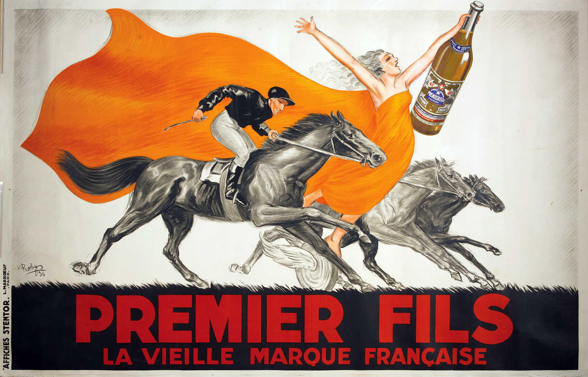
With this growing market for leisure, venues began to advertise more than ever, catering to a working-class society that sought ways to brighten their day-to-day lives. Plus, entertainment was only part of this new consumerism. Households began to spend significantly more money on food and household products, hosting numerous guests at weekly dinner parties. Advertisements began to spotlight food and alcoholic beverages suitable for entertaining. Think: origins of the salad oil and advertisements for chips and beer (although Chandon and salad oil are a bit more elegant).
Advertising & the Culture of the Café
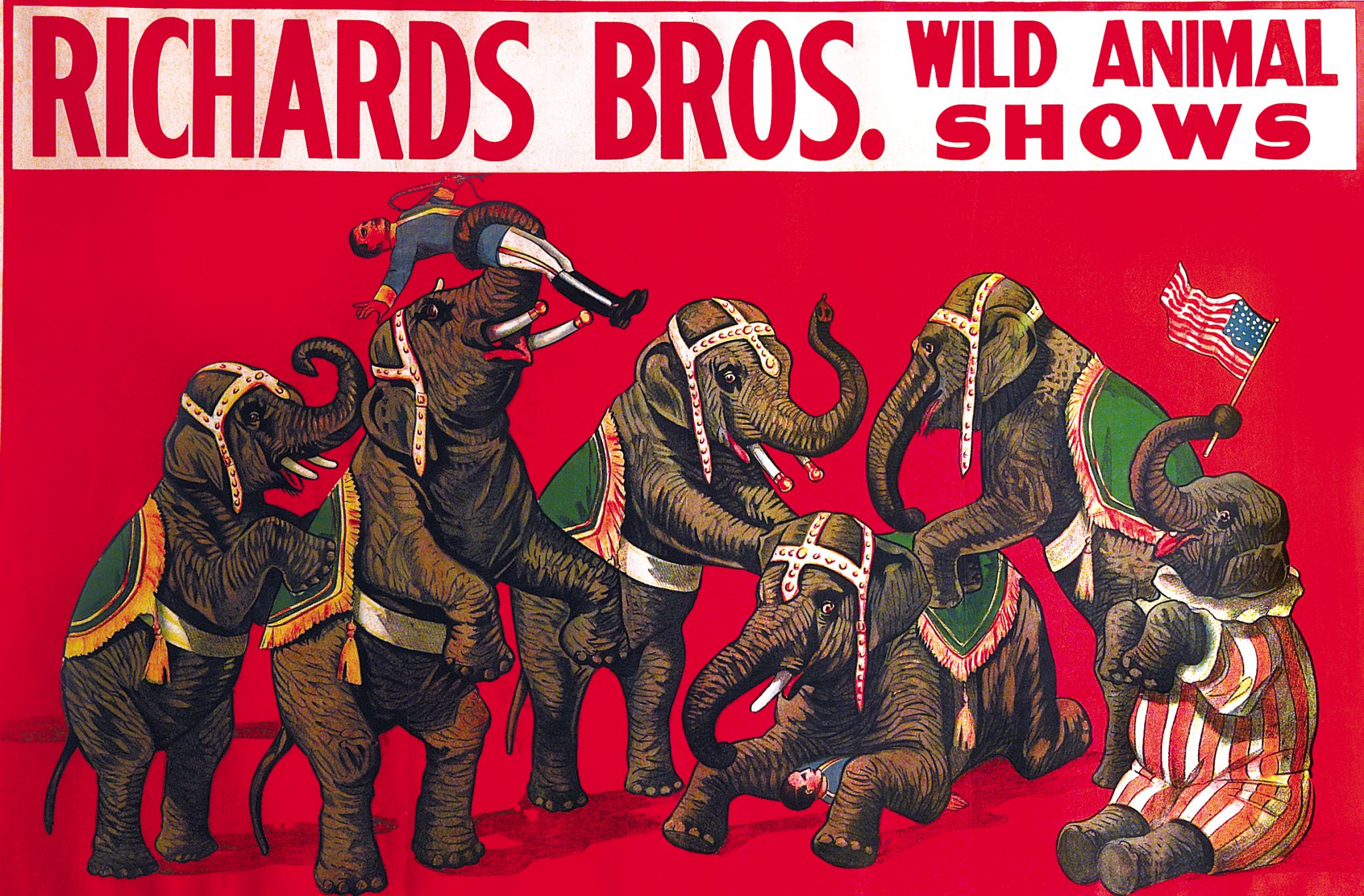
Parisians were suddenly living within a voyeuristic society, spurred by ballerinas, circuses, boating and horse races – an endless supply of entertainment. With all these options, venues and retailers began advertising their shows and products, showcasing anything from brands of cognac to plays at a theater. Bicycle manufacturers catered to their leisurely new public, portraying the mobility of the weekend lifestyle that each person desired. With an increase in literacy and a pressing need for advertising, the lithographic process was perfected, one of the city’s first forms of artistic pulp culture. Below is an example of a similar American lithograph advertising the Richards Brothers Wild Animal Shows in 1900.
From Outside In: Jules Cheret and the “Cherettes”
Jules Cheret (1836-1932) is occasionally referred to as the “father of modern lithography” because of his three stone process of printing. Before this time, each color had to be printed separately, very carefully. With Cheret’s new process, printers could print any color through a combination of three stones and transparent ink.
Cheret’s often large-scale lithographs became incredibly popular for their bright colors and provocative subjects. His lithographs usually advertised themes of Parisian nightlife (theater, alcohol, and dancers) through depictions of scantily clad women, dubbed “Cherettes.” These women were used to promote an idealized lifestyle, saturated with the glamor of the new Paris.
The female images became so popular that other artists began copying Cheret’s style. Lithographs were rising as an artistic medium and artists of fine art began testing the waters at print houses. People were tearing artists’ lithographs off the sides of buildings, taking them home to frame and place on their own walls.
Between 1890 and 1900, Cheret capitalized on the idea of publishing artists’ lithographs as saleable portfolios. The “Maîtres de l’Affiche” (Masters of the Poster) were sold as packets of small-scale, 11 x 17” works, created by well-known contemporary Parisian artists. Ninety-seven artists worked with Cheret’s print house, Chaix, to create these small-scale works for people’s homes, printed on a heavier, more durable paper that would last longer than the mass-produced advertisements. Furthermore, the word “affiche” means more than simply a poster. It refers to the art of the people and of the streets, a different tone than the connotations of mass production that the English word “poster” implies.
Developing Style in a Progressing Age
Like every great artist, each developed his own style, drawing from or pushing against artists before him. For Cheret, it was the Rococo. His effeminate, vivacious figures fell neatly along the eighteenth century florid and graceful style, highlighting playful and fluid pastels.
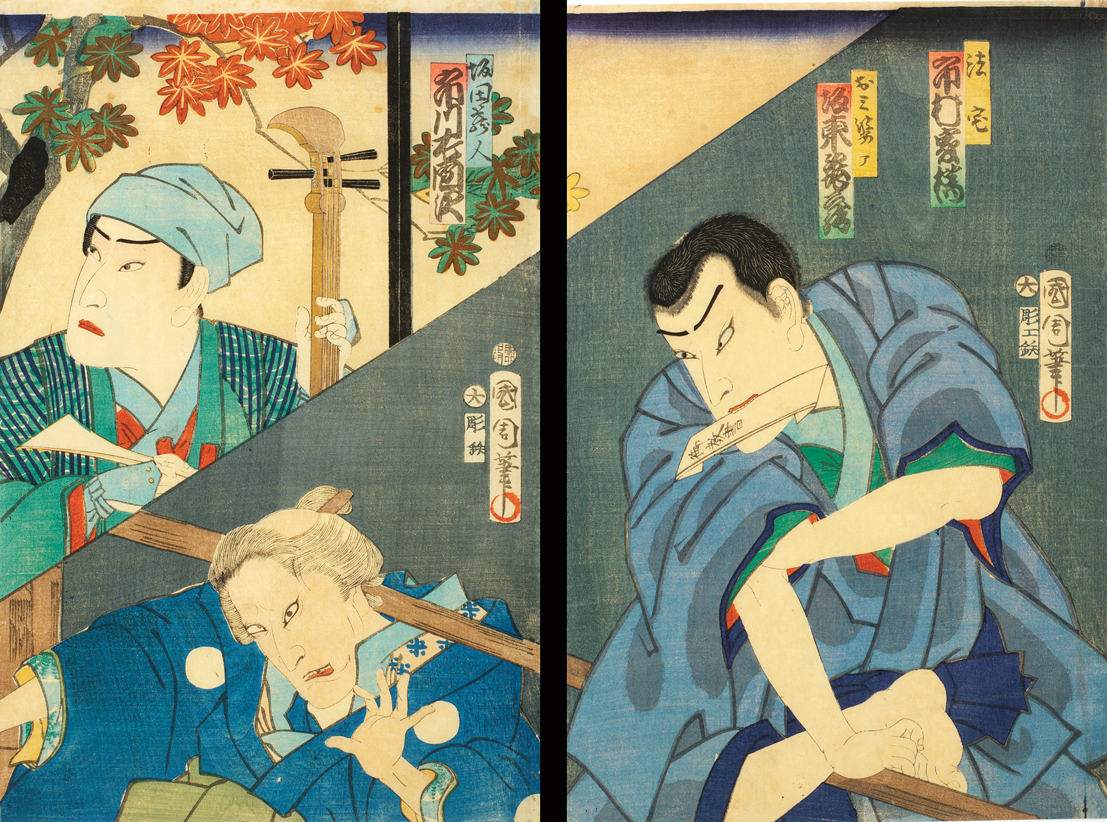
Like the Impressionist painters working at the end of the nineteenth century, commercial lithographers began to develop their own styles, drawing from the newly popular Japanese prints with their heavy outlines, flat perspective, and bright planes of color (see Toshihide’s example below). Henri de Toulouse-Lautrec (1864-1901) was an artist straddling the line between commercial and fine art, developing works that easily bridged the gaps between his advertisements and paintings.
Lautrec was not the only artist to work in both commercial and fine arts, either. Alphonse Marie Mucha (1860-1939), nicknamed the “Father of Art Nouveau” is known for doing the same. His commercial lithography was famous for his signature depictions of long, fluttering hair, which he transferred to his few, but significant, decorative panels. For Mucha, everything was about beauty, so the coinciding style of Art Nouveau (originally named “Mucha Style”) had no commercial or intellectual message, solely founded on aesthetic principal. This didn’t mean that Art Nouveau wasn’t applied to advertisements, however, because it was. Art Nouveau was all-encompassing, seamlessly connecting fine art with architecture, furniture, jewelry, fashion, and interior decoration, defining an entire visual identity between 1890 and 1910. 
By 1900, Mucha was one of the most famous commercial artists in the world. He created pieces for the 1900 Paris World’s Fair, designed to position Art Nouveau as the style of the twentieth century. Mucha worked in many different media, as well, like his jewelry.
The “father of modern advertising”, Leonetto Cappiello (1875–1942), was the first artist to tug on the subconscious to sell his products. By using a solid black background and singular, intense characters, he was able to link a brand to an idea without showing the product itself. Advertising mogul, Leo Burnett, would expand on this idea in the 1930s, arguing that subliminal advertising like this created visual triggers to sell the product.
Then and Now
By the time the twentieth century approached, heavy cultural stereotypes had been created. An idealized body image for women came out of Cheret’s lithographs, something western culture has yet to shake. Our consumerism, from food and beverages, to fashion, entertainment and travel, follows us everywhere. Advertisements of every medium – from historic lithographs to print ads and digital campaigns – shed light on the journey of our capitalist society.
But it’s not all bad! The really great advertisements and illustrations turn a mirror on their audience that provides insight and a new perspective through design, humor, and intelligence – without the tricks. Great ads provide an enlightening social commentary – advertently or inadvertently – of the culture from which they were produced. And who does a better job of questioning the world than the artist?
Today, artists and advertising still go hand-in-hand. (Forgive the corny analogy, but…) like Superman’s alter ego is Clark Kent, thus the artist is an art director. They are the same, living in different environments. In fact, the majority of fine artists have begun their careers as commercial artists, quite often as illustrators and graphic designers. Norman Rockwell is a wonderful example of a commercial artist using his magazine covers as social commentary. Andy Warhol, Edward Hopper, and Man Ray, also worked as commercial artists. Others like Jeff Koons and Roy Lichtenstein have been incredibly influenced by popular advertising, pulling its subject matter into their work.
Many of the artists you’ll discover at Park West Gallery have a relationship with commercial art and design, either as an initial career or simply inspiration. Check out Alfred Gockel, Peter Max, Misha Lenn, Leslie Lew, or Tim Yanke and you’ll realize that these artistic superheroes demonstrate that their art is both beautiful and interpretive, reflecting the changing culture in which we all live.
A variety of nineteenth century lithographs are available for purchase through Park West Gallery and its cruise art auctions at sea. For more information, please visit www.parkwestgallery.com.


